- About MAA
- Membership
- MAA Publications
- Periodicals
- Blogs
- MAA Book Series
- MAA Press (an imprint of the AMS)
- MAA Notes
- MAA Reviews
- Mathematical Communication
- Information for Libraries
- Author Resources
- Advertise with MAA
- Meetings
- Competitions
- Programs
- Communities
- MAA Sections
- SIGMAA
- MAA Connect
- Students
- MAA Awards
- Awards Booklets
- Writing Awards
- Teaching Awards
- Service Awards
- Research Awards
- Lecture Awards
- Putnam Competition Individual and Team Winners
- D. E. Shaw Group AMC 8 Awards & Certificates
- Maryam Mirzakhani AMC 10 A Awards & Certificates
- Two Sigma AMC 10 B Awards & Certificates
- Jane Street AMC 12 A Awards & Certificates
- Akamai AMC 12 B Awards & Certificates
- High School Teachers
- News
You are here
Math and Art: The Good, the Bad, and the Pretty
When Franklin and Marshall College mathematics professor Annalisa Crannell started teaching a freshman course on mathematics and art, she thought she was pairing “a scary thing, math, and a fun thing, art.” Her students turned out to be more scared of art than they were of math.
These students may be part of the reason why on September 23, when Crannell addressed the filled-to-capacity Carriage House on “Mathematics and Art: The Good, the Bad, and the Pretty,” she did not discuss the mathematical artwork of M.C. Escher, Penrose tiles, the golden ratio, or fractal art. Instead, her Distinguished Lecture focused on the use of mathematics to create realistic art.
Most realistic art aims to depict a three-dimensional world on a two-dimensional canvas. The geometry of the situation becomes clear if we think of the canvas as a plane and the artist’s eye as a point, and remember that light travels in straight lines. The artist’s lines of sight intersect the (temporarily transparent) canvas, mapping each point the artist sees in the real world to a corresponding point on the canvas. The picture looks realistic if this mapping is accomplished accurately.
Renaissance artist Albrecht Dürer explained several mechanical methods for achieving this mapping, including one that Crannell described as “the original dot matrix printer,” in his 1525 treatise The Painter’s Manual. However, these mechanical methods were prohibitively cumbersome and required that the artist stay sufficiently close to the subject.
Near the end of his treatise, Dürer included a section on mathematical perspective, a major development in art during the Renaissance. Dürer showed interest in mathematics in other ways as well: He translated the collected works of Euclid; and his engraving “Melancolia” includes a magic square, geometric solids, and other symbols of mathematics.
Crannell demonstrated the essential concepts of perspective art by drawing a cube with front and back faces parallel to the canvas and therefore represented as squares. The remaining four edges of the cube are parallel to each other but not parallel to the canvas, so they lie along lines that converge to a vanishing point.
The location of the vanishing point determines our vantage point in the scene: We see the left sides of objects to the right of the vanishing point, the tops of objects below it, and so on. Here is our first hint that perspective art encodes information not only about the subject of the work but also about the artist and viewer.
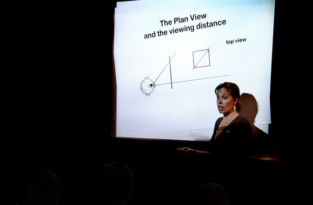
We know that objects of the same size (such as the front and back faces of the cube) are represented in pictures as smaller if they are farther away. Mathematics enables us to state this intuitive idea more precisely: Objects of the same size appear in the picture with heights (and widths) inversely proportional to their distances from the artist. Once again, the artist or viewer is part of the equation, implying an optimal distance from which to view perspective art.
In our example, this viewing distance can be determined from the relative sizes of the front and back faces of the cube, so the artist sets it when choosing how far toward the vanishing point to extend the four remaining edges of the cube. From the wrong viewing distance, the object may not appear as intended.
One fun and surprising consequence of this idea is that even if these edges look too long, so that you’ve drawn an elongated cube by mistake, you have succeeded: your drawing is of a cube—when viewed from the right distance.
Crannell provided handouts so that audience members could try this trick. A simple geometric construction determined the optimal viewing distance from the vanishing point. As if by magic, with our eyes directly in front of the vanishing point at the proper distance from the paper, the elongated cubes transformed into perfect cubes.
This effect also explains why our vacation photos don’t look as good as the scenes they capture and why art looks better full-size in a museum rather than shrunk to fit into a book. As pictures shrink, optimal viewing distance does too, sometimes to the point of impracticality.
At the right distance, perspective art looks incredibly realistic, and we get a sense of being in the picture. The relatively simple mathematics of perspective art can also be used to create optical illusions and, in photogrammetry, to determine geometric properties of objects from pictures.
Crannell emphasized that perspective art “isn't just about what the artist did; it's also about ... the relationship of the viewer, you, to the image you’re looking at.”—Rachel Kirsch
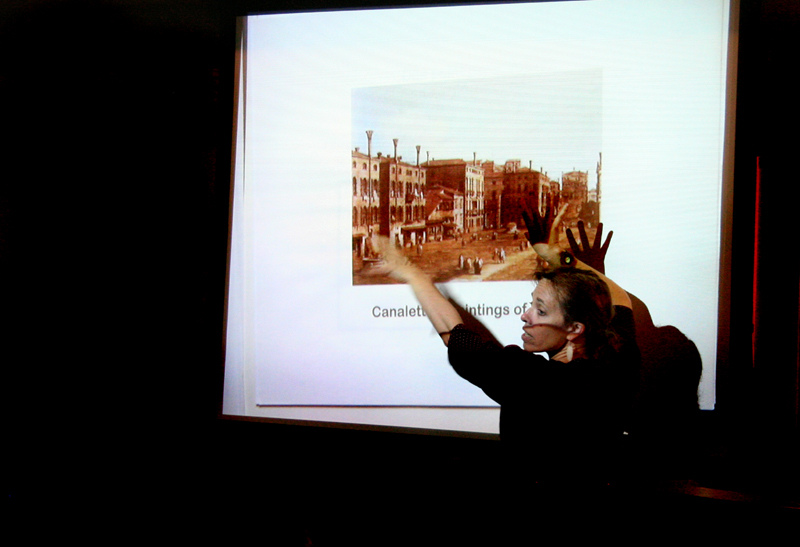
Crannell presents a puzzle to her audience during her MAA Distinguished Lecture.
 Listen to the full lecture (mp3)
 Listen to an interview with Crannell (mp3)

This MAA Distinguished Lecture was funded by the National Security Agency.


.jpg)


